Your data has a story. Share it with the world.
Visualize and publish data on topics you care about. Explore and be inspired by creations from like-minded data enthusiasts.
Available for Windows and Mac | Privacy Policy
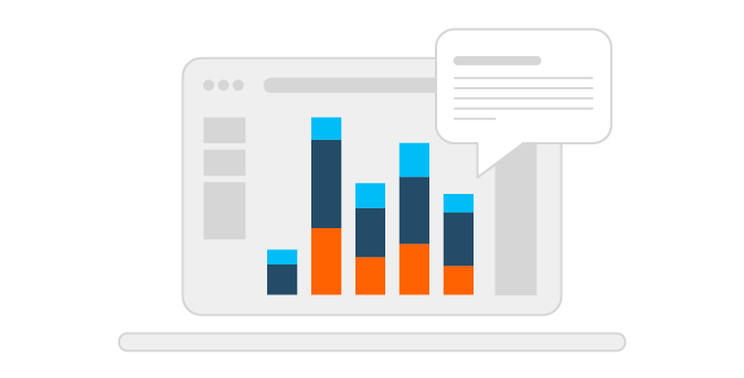
Data Storytelling
Easily create stunning interactive visualizations on our free platform. No coding required.
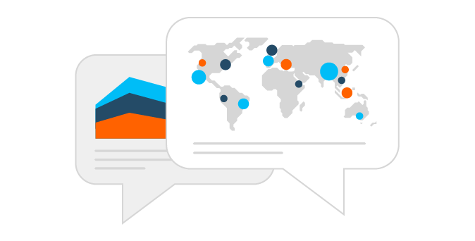
Spark Conversation
Connect with authors from around the world. Embed your visualizations on a personal website, blog, or social media.
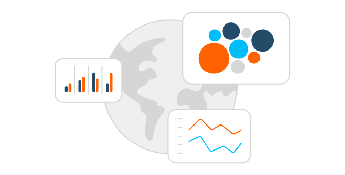
Be Inspired
Explore and interact with the most extensive library of data visualizations in the world with over 1 million user-generated possibilities.

While Toronto is often referred to as the most diverse city in the world, its minority populations are primarily concentrated in low-income areas. In this visualization, inspired by Steven Shoemaker’s recent Viz of the Day, JR Copreros uses 2016 census data to look at income inequality across Toronto's neighborhoods.

Finalists took care of viz-ness (the Tableau way) in the 2020 Iron Viz Championship
It wouldn't be TC without the ultimate data showdown—Iron Viz—and this year was no different. Three fierce contestants took the virtual stage to have their “data with destiny.” The Iron Viz global...

Community & Resources
Explore resources to help you get started, or kick your visualizations up a notch.
Learn More